9 Modern Marijuana Brands Mastering The Art Of High Design
High design, when creating modern marijuana brands, translates to one thing: Simplicity.
High design, when creating modern marijuana brands, translates to one thing: Simplicity. From bath and beauty to energy drinks, the market for “personal enhancement” products is the ideal place to bring cannabis, not only to secure its image as mainstream but to make a serious profit. How do you market to this type of audience?
All the companies mentioned share the vision of where the roads of brand marketing and customer satisfaction meet. The results are as exciting as they are telling of where the future of cannabis lies. Let your imaginations run wild.
1. Hi.
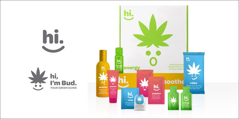
Designed by Mau Design, Los Angeles.
Hi. is a monthly subscription service that demystifies and democratizes the concept of living with cannabis. Hi. breaks down their “BudBoxes” into experience-driven categories: Soothe, Relax, Passion, Energy, and Focus.
With pre-measured, optimal dosages and a casual, welcoming feel, the brand would be right at home next to 5-hour energy or pampering face-masks. Leading with a general cheeriness and bright color palette, the brand would simplify the use of cannabis in a way that is easy for customers to understand and embrace.
2. Okay
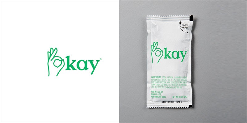
Designed by Base Design, New York.
“A socially accepted additive as common as coffee or chamomile tea – in essence, a less sinister version of Soma from Aldous Huxley’s Brave New World. Consider it a generic ‘masstige’ product that has become the Kleenex of its category, one that feels as ubiquitous in our culture as Sweet ’n Low or Budweiser.”
3. Sprankles
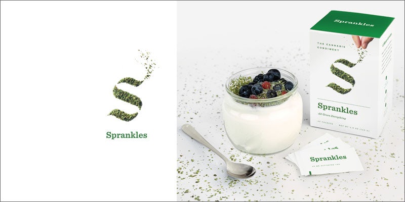
Designed by Franklin, New York.
“Original cannabis condiment. A premium blend of flower crumbles and kief, decarboxylated to optimize the medicinal or psychoactive effect, it turns anything into an herbal edible. Sprankles is a conflation of the words ‘sprinkles’ and ‘dank’ – the latter a slang term for high-quality marijuana. It also sounds a bit hip-hop, which we like.
Packaged in single-serve packets, it’s convenient and discrete. The visual identity is clean, modern, a bit irreverent, and primarily focused on showcasing the herbal shake.”
4. L’enfer est Volontaire
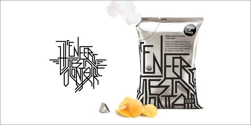
Designed by Karlssonwilker, New York.
“Our brand’s name is French. And it rhymes. It’s quite long, unwieldy, and nicely pretentious. It means that hell is only optional, that one has a choice to live in it or not. The accessible premium products of L’Enfer Est Volontaire (or L’EEV) give you that choice.
The first one is a bag of artisanal chips filled with organic weed smoke from the Rocky Mountain, conveniently sealed together for highest quality and freshness. Adding marijuana smoke doesn’t use any additional energy or resources in its supply chain than an ordinary bag of chips.”
5. Hi
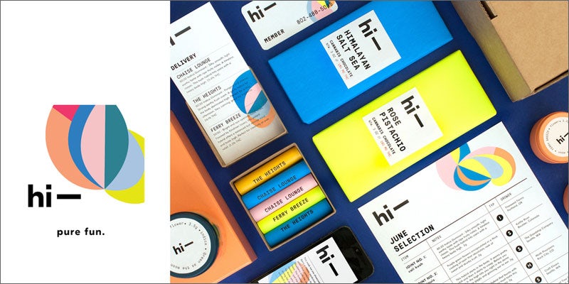
Designed by MGMT, Brooklyn.
“Our brand is a personal chronic concierge, providing both on-demand delivery service via mobile and web and a monthly curated selection of high-end organic varietals. Products vary each month and include artisanal take on classic munchies: Himalayan sea salt chocolate bars, organic gummy bears, and hybrid kale chips – all providing a guaranteed ‘Hi.’
The aesthetic could be described as a post-modernist lava lamp; the mutable logo acts as a free-spirited doodle. Inspiration was drawn from Karel Martens and Gabriel Orozco. Unfortunately, no products were tested during the creation of this image.”
6. Skunk
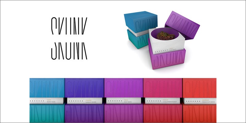
Designed by Original Champions of Design, New York.
“Skunk’s aerated packaging delights your sense of smell on first contact. Across a miscellany of products, scent and sensation work together to affect your mood. Cool undertones of sandalwood relax; zesty wafts of lemongrass energize.
The brand and its packaging design reflect the way you’ll feel when using Skunk. In marijuana culture, ‘skunk’ refers to strong-smelling cannabis strains. We liked that, so we adopted it. We encourage users to let their noses guide them.
Product names like Sunday Paper, Easy-Bake, and Colombian Roast are equally deliberate, evoking pungent aromas associated with mood-changing moments.”
7. Water Water
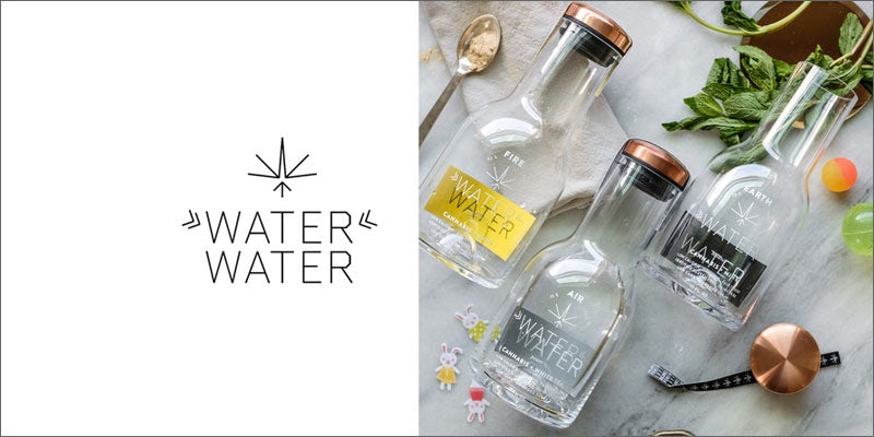
Designed by Omnivorem, Brooklyn, Portland, and Los Angeles.
“Water Water is marijuana-infused, organic, and has fewer calories than alcohol. Flavors in three different THC levels pair with supplements to accent the three pillars of the working mother’s life: Work (“Air” – power), children (“Earth” – balance), and partner/relationship (“Fire” – love).
Water Water was born out of our own chaotic lives as working mothers. We wanted to poke fun at our impossible dream to “do it all” without sacrificing anything.”
8. Allay
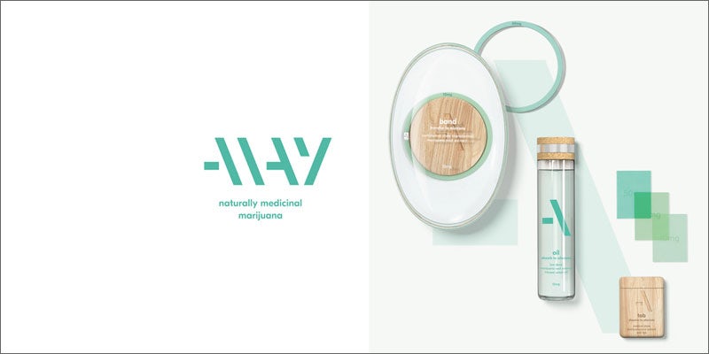
Designed by PearlFisher, New York and London.
“Allay is a product range that uses the naturally alleviative properties of the marijuana root to relieve persistent symptoms of stress, sickness, and pain.
Taking a number of on-the-go lifestyle forms, including a wristband, an edible oil, and dissolvable oral tabs, the selection is designed to soothe and sedate by intuitively administering controlled and customized medical dosages of marijuana. The aesthetic is simple, calming, and pure, challenging the traditional and functional language of the pharmaceutical category.”
9. Botánica
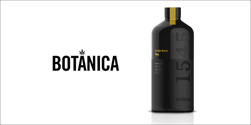
Designed by Saatchi & Saatchi, New York.
“Cannabis and tea are combined here to create the Botánica 1545 cannabis-infused botanical teas. The name is no accident: We chose the Spanish word for botanical and 1545 is the year cannabis officially arrived in the New World aboard a Spanish ship.
Interestingly, tea – having been introduced to Europe in the 16th century from China – would likely have begun to make its way to the New World around the same time. The historical Spanish connection inspired not only the name but also the bottle form and pattern design.”
The Future Is High Design
While the cannabis industry is spreading its wings and taking the product in directions never before dreamed, the marketing language and image of the products themselves are still struggling with their roots in slang, kitsch imagery, and the remnants of hippie and stoner culture that burden it with a negative association.
The importance of using high design with bringing cannabis into the mainstream encompasses nuance, grace, and style. As the plant itself has evolved over the years from the weed our grandparents smoked to the potent powerhouses of today, so too must the image of the plant. The future should be embraced, as it will usher in acceptance and take the industry, and customers, out of the shadows.
What does your customer want to get for their money? It isn’t a weirdly named plant or an overwhelmingly intense experience. With the growing acceptance of the recreational market, the biggest new customer base is that of low-dose daily enhancement. From soccer moms to senior citizens, the key to a large customer base is catering to everyday lifestyle, improved. That is the future of cannabis and the way we need to brand it in order to move forward.
Do you think a product marketed with high design would be more accepted by your friends and family that look down on cannabis? Could you see your mom, or your conservative co-workers, suddenly talking about one of these products with excitement? Share your thoughts on social media or in the comments below.
Herb Recommended Products:
READ MORE

